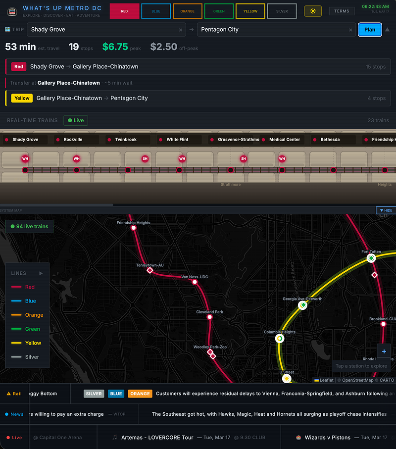
I built a DC Metro companion app called “What’s Up Metro DC” in nine days, using only my iPhone during my commute from Shady Grove to Pentagon City on the Red and Yellow lines. Each day, I spent about an hour and forty-five minutes round trip typing prompts into Claude while the train passed through about 19 stops. By the end, the app had about 7,400 lines of code and 40 commits. It uses React 19 on the frontend, an Express.js server, live train tracking from WMATA’s API, local points of interest from OpenStreetMap, events from Ticketmaster, a DC news feed from three sources, and interactive maps with Leaflet and D3.js. The app works. People can use it. I wanted to document the journey.
This is not a victory lap about how good Claude is at writing code. It is about what actually happened when I worked with it to build something real, under real constraints, with deadlines measured in Metro stops. What did it handle well? Where did it miss? When did I have to step in with judgment, taste, or lived experience? The answers are more nuanced than what you usually hear from enthusiasts or skeptics.
The Setup Nobody Would Recommend
The development environment mattered a lot. I did almost everything on my iPhone, using Safari and Claude’s iOS app. I used its code feature to push changes to GitHub, with Firebase handling hosting and keeping data fresh.
That meant no laptop on the train, no external monitor, no Chrome DevTools, and no real terminal beyond what the iPhone code environment provides. I had a MacBook at home for occasional testing and setup, but most of the coding and iteration happened on that phone. DC Metro’s connectivity was solid, so I rarely had to worry about losing access.
I was using Claude Code on a twenty-dollar-per-month subscription. I often hit my token limit during the morning commute, then did another session on the way home, while Firebase quietly served the app in the background for roughly half a cent a day. I used Opus for the design and architecture questions and Sonnet 4.6 for the coding heavy questions. I could get through about half the train ride on Opus only before hitting max tokens.
Working on the Metro without a laptop changed how I collaborated with Claude. Without DevTools to poke at elements and drag sliders, I had to describe what I was seeing, altough, the snap an image on the phone and attach it to the question worked really well.
Instead of “move this up a bit,” I would write: “The station labels are invisible against the dark background. They look like they are rendering around “y = 110” in the SVG, below the track visualization, down where the tunnel floor is.” That kind of description makes for a much better prompt. It forced me to really look at the UI, think about why it was wrong, and explain that, instead of just nudging pixels until it felt right.
I was also testing every feature under the conditions for which it was built. I was a Metro rider building a Metro app while riding the Metro. When live train positions are updated, I can check whether the real train matches its dot on the screen. When the news ticker loaded, I was reading it on the same five-inch display every future user would have.
That sounds minor, but it was not. Claude cannot see what the app looks like on a phone. It cannot ride the Red Line and squint at tiny text on a dark SVG. The gap between code that is logically correct and a product that actually works for a human in context is where I had to step in again and again.
What Claude Did Well, Unprompted
I want to start with what worked, because that is only fair. The things Claude did well were genuinely impressive and deserve specific credit.
When I described the app concept and rough architecture, it generated structurally sound React components on the first pass more often than not. The component breakdown was reasonable. State management was consistent. The Express.js server, which ended up around 904 lines, was organized and readable.
When I asked for an endpoint to proxy the WMATA API with caching, I got exactly that: an endpoint that did the proxying, with proper error handling and sensible cache TTL values, without me having to spell out every detail.
There is a commit in the repo called “Security and operational excellence hardening.” All I said was, “I want to work on operational excellence and security. You are a security engineer and pen tester, let’s make this production safe.” Claude did not just add a token check or tweak a header. It did what a careful security engineer would do in a review. It produced a full set of recommendations: Content Security Policy headers, CORS restrictions, input sanitization, validation of user-provided URLs, and rate limiting. Then it implemented them using Helmet for CSP, configured CORS, enabled sanitization middleware, and enabled rate limiting.
Most of that was correct and appropriate. It felt like the kind of “we should probably lock this down” pull request you would get from a conscientious teammate on a Tuesday afternoon, except it arrived on demand.
The CSP headers were too strict at first. Helmet’s default CSP blocked the external tile server URLs Leaflet uses for map imagery, so the map stopped rendering tiles. I caught that by testing on my phone and seeing a blank map where tiles should have been. Claude understood the issue right away and relaxed the CSP just enough to allow the tile domains. That pattern was important. The proactive security work was solid, but it still needed a human to notice that something visual had quietly broken. Claude can reason about CSP in the abstract. It cannot see that your map is a gray rectangle.
Claude also excelled at tedious work that would have taken me days. The app includes points of interest data for 94 Metro stations. When I asked for a train car lookup table that mapped each station to the best car for a quick exit near escalators or elevators, it filled out the whole table in one go.
Were all 94 entries correct? No. Based on my own experience, some were clearly wrong, and I fixed the ones I recognized. But getting that full scaffold, every station represented with plausible guesses, would have cost me an entire weekend of research. Claude did it in one response. I spent twenty minutes correcting the parts I knew.
That pattern repeated across the project. Claude produced the 90 percent draft, and I supplied the last 10 percent where domain knowledge or taste was required.
The .ru Domain Incident
Here is a story that shows the limits of judgment.
The app uses the Overpass API to query OpenStreetMap for points of interest near each station. Overpass is a volunteer run public API and can be flaky. During one session, I was dealing with timeouts. Claude, trying to be helpful, added fallback mirrors for Overpass. One of them was overpass.openstreetmap.ru, a technically legitimate Overpass mirror hosted in Russia. It worked. It returned valid data. From a technical standpoint, it was a reasonable fallback.
I removed it immediately. My prompt was something like, “Do not call .ru domains.”
Claude removed it without debate. No pushback, no “but technically it is fine,” just compliance. That is the behavior I want. But the reason I asked matters. My objection was not technical.
The mirror worked. My concern was about trust, perception, and values. I do not want my DC Metro app making requests to a Russian hosted server, not because I expect tampered data, but because I have priors around operational trust and user perception that exist outside the HTTP specification. If a user inspected their network traffic and saw calls to a .ru domain from a Metro app, it would, at best, feel strange.
Claude focused on the technical goal: to make Overpass queries more reliable. It found a working mirror and added it. The mirror’s location had implications it could not see, because those live in human trust, context, and geopolitics, not in status codes.
This is exactly the kind of decision Claude cannot make on its own. It did not do anything “wrong.” It behaved like a technically correct optimizer. The problem is that technical correctness is necessary but not sufficient for software that has to live in the real world.
The News Problem: Solving the Wrong Thing Correctly
The news feature went through three distinct phases. That arc is one of the best illustrations of how collaboration like this actually plays out.
Phase one: I asked for a DC local news ticker. Claude built it using keyword filtering across GDELT, NewsAPI, and GNews. If an article’s title or description mentioned DC, Washington, Capitol, Metro, Maryland, or Virginia, it qualified. The implementation was clean. The results were awful.
I got a feed full of White House press briefings, congressional budget fights, Supreme Court arguments, and national political stories, and sports, so much sports that it took a while to get to any other news. All of it was technically “DC content.” A Washington Post piece on a Senate filibuster mentions Washington. A CNN story on the President mentions DC. The keyword filter worked exactly as specified.
The problem is that news that mentions DC is different from news for people who live in DC. Someone opening a Metro app wants to know about a water main break on H Street, a new restaurant in Shaw, or weekend road closures on Rock Creek Parkway. They do not care about the latest continuing resolution vote, even if it is happening a few miles away, and if they did then another news source would be a better fit.
I pulled the ticker out of the app for a few days.
When I came back, I brought a different architecture. Instead of keyword filtering content, I specified a domain allow list: WTOP, DCist, WAMU, Washington City Paper, Greater Greater Washington, PoPville, ARLnow, Bethesda Magazine, Washingtonian, and a handful of others. The filter moved from what the article said to who published it. If it came from a DC local outlet, it was local news. If it came from CNN or Reuters and happened to mention Washington, it was not.
Claude implemented that architecture cleanly. The NewsTicker component ended up at 394 lines, handling aggregation across sources, deduplication, sorting by recency, and rendering a smooth scrolling ticker. All of that implementation was Claude’s. The core insight, the decision to filter by source identity rather than keywords in the text, was mine.
I had to understand the problem at a level Claude could not reach, because that understanding comes from knowing what it feels like to be a DC resident who is exhausted by national politics, wanting only to know whether your bus is detoured or whether the Wizards won.
This pattern kept repeating. Claude is excellent at implementing well specified solutions. If the specification is wrong, it will happily implement the wrong solution with the same skill and confidence. It has no internal sense that the specification is off, because here “wrong” means “does not match a human need the developer has not articulated yet.” Often, the developer does not realize the specification is wrong until they see the output and feel that something is off.
Then the human job is to diagnose the real problem and re specify. Claude’s job is to rebuild, quickly and without complaint.
Seeing What Claude Cannot See
The station label bug was, in some ways, the simplest issue I hit and, in other ways, the most revealing.
MetroTrack.jsx is 895 lines of React that render an SVG visualization of the DC Metro system: stations, track lines, live train positions. Claude built the initial version from my description. I wanted it to feel like you were standing on a Metro platform, looking down the tunnel, with station names visible and train dots moving between them.
Structurally, it was excellent. The SVG paths were correct. The animation logic was smooth. The station labels were SVG text elements positioned at “top: 110” in the coordinate space.
The problem was that “top: 110” put the labels down near the track bed, rendered in dark gray on a dark background. The labels existed. They were just almost invisible. On a large monitor, you might squint and see them. On a phone, in a moving train, under fluorescent lights, they were functionally unreadable.
I caught it somewhere between Bethesda and Medical Center. I typed: “The station labels are invisible. They are too low in the SVG, on the dark tunnel floor. I snapped a picture and attached it to the prompt. Move them up into the vault arch area, around top: 18, and change the color so they pop against the ceiling.”
Claude fixed it in about thirty seconds. Two tweaks: position and color. Trivial.
Noticing the problem required a human staring at a phone screen. No amount of static analysis or abstract reasoning about SVG coordinates would flag it. The code was correct. The output was unusable. The gap between those two states only appears when a person uses the thing in context.
This happened constantly. Every visual glitch, layout issue, contrast failure, or too small font size was something I noticed while actually using the app on the train. I would describe the issue, and Claude would fix it immediately. The fixing was easy. The seeing was hard, and only a person could do it.
Changing the Problem Instead of Fixing the Symptom
The Overpass API reliability issues are the example I keep returning to when people ask what the human’s role is in work like this.
Points of interest kept failing to load. Overpass, being volunteer run, would time out or respond slowly, and it has a rate limit that would be maxed out if a few users were on the app. I told Claude. Its response was excellent by the standards of the question I had asked. It added retry logic with exponential backoff, increased timeouts, added a secondary mirror (including the .ru one), and improved error messaging so users saw “Loading nearby places…” instead of a blank screen.
All of that was technically solid. All of it was aimed at the wrong problem.
The real issue was not that a single Overpass request failed. It was that the app’s architecture relied on live calls to a fragile volunteer API whenever a user wanted nearby places. Ninety-four stations, each with a custom query and bounding box, each returning multiple points of interest, is a lot of load and a lot of chances to disappoint a user.
Somewhere over the Potomac on the Yellow Line, I realized the architecture itself had to change. Instead of querying Overpass at runtime, I would query it at build time. A script would hit all 94 station queries, store the results as static JSON, and ship them with the app.
At runtime, the app would follow a four tier strategy. First, check in memory cache. If that is empty, load the baked JSON. If the baked data is stale, try a live Overpass query. If that fails, fall back to the stale data. With a 15 day TTL, live queries would be rare. The app would hit the volunteer API once every couple of weeks per deployment instead of hundreds of times per user per day and to the user the points of intrest would load really fast.
I described this architecture. Claude implemented it: the build script, the static JSON generation, the four layer fallback, the TTL logic. The implementation was Claude’s. The architecture was mine.
It had to be. Deciding to pre-bake the cache was not primarily a coding decision. It was a product decision. It required thinking about the full experience. What it feels like to stare at “Loading…” underground. What it feels like when everything is instantly there. How to respect a volunteer API. Those are judgments about the kind of product I wanted to build, not conclusions you get from “fix the Overpass timeout errors.”
Claude was fixing the symptom. Requests fail, so make them more resilient. I changed the problem. Avoid the requests in the first place.
Learning the difference between symptom fixing and problem changing was one of the most important lessons of this project. Claude is extremely good at the former. The latter is still on us.
The WMATA Circuit Puzzle
Not every steering moment involved overruling Claude. Sometimes it required me to understand the problem deeply enough to give it the right specification.
WMATA’s real time train API does not provide latitude and longitude for trains. It gives circuit IDs, sections of track between two points. A train is “on circuit 417.” To show that train moving smoothly on a map, you have to map circuit IDs to geometry, to the stations they sit between, and to where those stations are.
Three API endpoints are involved. One gives the train’s current circuit and direction. Another maps circuits to station codes. A third lists all circuits in order along each line.
Claude’s first pass joined these data sources and produced positions. Structurally, it was fine. The interpolation was wrong. Trains snapped from one station to the next instead of gliding between them. One frame, they would be at Gallery Place, the next at Judiciary Square, with nothing in between.
To fix this, I had to understand WMATA’s model. The key fields were prevCode and nextCode, the stations on either side of the train, and the circuit offset within that span.
I specified: “Compute a progress float between 0.0 and 1.0 representing how far the train is between prevCode and nextCode. Use the circuit offset within the span between those two stations. Then interpolate between prevIdx and nextIdx in the station position array.”
Claude implemented it correctly as soon as it had that specification. The code was Claude’s. The specification was mine, forged from reading documentation, understanding the circuit model, and reasoning about interpolation.
I could not have written that code as quickly. Claude could not have invented the algorithm from scratch. That part felt like real collaboration, two different kinds of intelligence doing what each is best at.
Four Features, One Prompt, and the “Should I Run” Verdict
Around day five, I sent Claude a single prompt asking for a trip planner feature. I did not just ask for a trip planner. I asked for:
• Destination ETA
• Connecting lines and transfer information
• Transfer wait predictions using live schedule data
• A “should I run” verdict when you are approaching a station and wondering if you will make your transfer
• A recommendation for which car to board for the best escalator position at your destination
Claude built it all in one response. It generated a sizeable amount of new code across all five sub-features. The component structure made sense. The data flow was reasonable. None of it was production ready, but all of it was good enough to iterate on.
The “should I run” verdict is the part I keep returning to. The four tier system, “You are fine,” “It is going to be close,” “Run,” “You missed it,” with thresholds based on minutes until departure, was my design.
I picked the tiers and cutoffs because I know what it feels like to sprint down the escalator at Metro Center, backpack bouncing, and need more than “three minutes.” I need a judgment. “You are fine” versus “You really should run.” Three minutes is plenty of time in some stations and tight in others, depending on escalator length and the distance from the entrance to the platform.
Claude does not have legs. It does not know what that sprint feels like. That decision came from being a person in that space.
The car tips feature leaned even more on human experience. Which car do you board at Rosslyn if you want to be near the escalator at Foggy Bottom? Claude generated a lookup table for all 94 stations with plausible guesses. Several of the entries I checked against my own experience were wrong. I corrected those. Others are probably still off.
The scaffold was invaluable because it gave me something concrete to react to instead of an empty file. The corrections demanded someone who has physically stood on those platforms.
The Design Problem
If there is a single thread running through all my corrections, it is design.
Not design as in snobbery. Design as a practical skill: being able to look at something and feel that it is off, then figure out why, and then explain how to fix it.
Early in the project, there is a commit: “Add DC Metro Quest app with retro gaming UI.” Shortly after that: “Redesign news panel with retro CRT aesthetic.” I made that terrible choice early on thinking it would be cool to see the city and tunnels in a retro gaming look. Left to its own aesthetic instincts, Claude reached for something flashy. Scanlines over the news ticker. Green on black CRT glow. Pixel fonts. A retro gaming look that would be great in a demo and completely wrong in a utility app that a commuter glances at for ten seconds.
I steered hard toward minimalism: dark mode, CSS custom properties and design tokens, muted colors, clean typography, and no decorative effects that do not do real work. The next commit: “Redesign news panel: clean modern editorial layout.”
Both approaches were technically correct. The retro UI was well implemented. The scanlines rendered. The glow worked. It was wrong for this product, this context, this user. I would have never been able to change the look and feel of an app this quickly without using Claude, it was impressive.
However, Claude tends to reach for visual complexity when given freedom: gradients, animations, layered effects, decorative borders. That likely reflects the examples it has seen, where many tutorials and demos try to be visually impressive. There is nothing inherently wrong with that. But a default is not a decision. Deciding that a Metro app should be calm, quiet, and utilitarian is a product judgment. That has to come from someone who knows how it will really be used.
The Mobile Irony
Here is a good bit of irony. The entire app was built on a phone. Every line of code was generated, reviewed, and committed on a phone screen. Yet there is a commit, well into the project, titled “Fix mobile phone compatibility across the entire app.”
Claude’s components, despite being authored in a phone based workflow, assumed desktop sized screens. Elements overflowed horizontally. Touch targets were too small. Text that looked fine in the implied desktop viewport was cramped and illegible on my actual device. Padding that felt comfortable at 1440 pixels created awkward gaps or overlaps at 390 pixels. The map container needed new proportions. The ticker needed different scroll behavior. The whole visual layer needed a mobile-first pass.
This makes sense once you remember the obvious. Claude does not have a screen. When it writes CSS, it reproduces patterns that are mostly desktop first.
My physical reality, a phone on a train, is invisible to it. I had to say explicitly: “This app is mobile. Design for 390 pixels wide. Desktop is the edge case.”
Once I said that, Claude handled the responsive redesign well. Realizing that it was necessary still required a human in motion, squinting at a phone.
The Station Summaries: Bias creeps in
The app initially called an endpoint that calls the Anthropic API to generate neighborhood summaries for each station, a feature I called “vibes.” Tap a station, and you get a short, conversational description of the neighborhood: what it is known for, how it feels, what you might do there; these would be cached and displaed at each stop.
So I used Claude to build an app that uses Claude. The outer Claude, my collaborator, wrote the code that calls the inner Claude, the runtime API.
What came back from the runtime calls is one of the most instructive failures of the whole project and one of the clearest examples of a particular kind of bias.
The stationCache.json file holds 94 stations, each with a neighborhood description that appears when you tap it. Early on, I asked Claude to generate those summaries. Given the station name, write a short bit about the neighborhood and what you would find there.
The results looked great at first glance.
Shady Grove: “a vibrant suburban gateway offering an outstanding variety of restaurants, lush green spaces, and a welcoming community feel.”
Bethesda: “a vibrant, cosmopolitan hub bursting with world-class dining, upscale boutiques, and a thriving arts scene.”
Navy Yard: “one of DC’s most electrifying waterfront transformations.”
Congress Heights: “a proud, deeply rooted DC neighborhood bursting with community spirit.”
I shipped them. Put the app on my phone. Rode from Shady Grove to Pentagon City, reading as I went.
Somewhere around Tenleytown, I realized I was reading the same sentence over and over.
Every neighborhood was vibrant, buzzing, dynamic, or thriving. Every restaurant was beloved, legendary, or a must order. Every park was stunning. Every community was tight knit. Every visit was “a fresh discovery.” I counted later. Eighty-one of the 94 stations used some combination of “vibrant, buzzing, world class, beloved, dynamic, exciting, thriving, incredible.” Eighty-six percent.
Descriptions of places tend to sound like this. Tourism boards are enthusiastic. Review sites are enthusiastic. Real estate copy is enthusiastic. Travel guides are enthusiastic. Claude learned that tone and applied it across all 94 stations, whether or not the neighborhood actually matches the brochure.
Underneath that cheerleading was a subtler, more uncomfortable pattern.
Wealthier neighborhoods got their superlatives attached to amenities. Bethesda had “world-class dining.” Tysons had “gleaming towers” and “luxury experiences.” Friendship Heights was “DC’s ultimate upscale destination.” McLean had “a surprisingly rich dining and cultural scene” with an “exceptional quality of life.” The language pointed to things: restaurants, shops, and cultural institutions.
Less affluent neighborhoods, especially those east of the Anacostia and along the Green Line corridor, got their superlatives attached to character. Rhode Island Avenue had “colorful murals, energetic storefronts, and a thriving local business scene.” Naylor Road had “deep rooted neighborhood pride.” Congress Heights was “bursting with community spirit and local creativity.” Anacostia had “deep community roots and a tight knit energy that feels genuinely inviting.” Southern Avenue had “deep local pride and a warm, welcoming character.”
Read those side by side. Both are positive. Both sound warm. One set is basically a restaurant guide. The other is a character reference.
The amenities focused blurbs make you want to get off the train and explore. The character focused blurbs make you feel like you are being gently reassured that it is okay to get off the train. That is the gap, and it maps uncomfortably well onto the socioeconomic and racial geography of the DC Metro.
I do not think Claude decided to be biased. It did something more insidious. It reflected, with real accuracy, how these neighborhoods are already described in real estate listings, travel pieces, community profiles, and local journalism.
Bethesda gets feature journalism and restaurant reviews because that is where many readers are imagined to dine. Neighborhoods east of the Anacostia get community profiles that emphasize resilience, pride, and warmth, written for readers who do not live there and might need convincing to visit.
Claude did not invent those genres of writing. It absorbed them and reproduced them at scale, assigning each style of praise to its usual zip codes.
That is the part that is hard to sit with. The bias is not in calling any neighborhood bad. Every description is positive. The bias is in the systematic difference in how places are praised, and you only see it in the aggregate. Reading a single entry, you would probably think, “That sounds nice.” Reading all 94 in order on a Red to Yellow commute, you start to notice which neighborhoods get “world class dining” and which get “deep community roots.”
A code review would not catch this. A test suite would not. Even a spot check of a few stations would not. The bias lives in the pattern.
I started correcting the ones I knew. My commute from Shady Grove down the Red Line to Gallery Place, then the Yellow Line to Pentagon City, covers a lot of ground. I know those neighborhoods. I know there is a specific Ethiopian restaurant near Columbia Heights that deserves to be called out by name, not folded into “vibrant cultural energy.” I know Anacostia has the Smithsonian’s Anacostia Community Museum, a real institution worth mentioning, not just “deep community roots.”
I fixed what I could. I only have deep, lived knowledge of maybe 30 out of 94 stations. The rest may still be describing “community pride,” where residents might prefer, “There is a fantastic Salvadoran place on the corner and a great park two blocks east.”
In the end, I pulled the generated summaries out of the primary station view. They are still in the cache file. They still power a secondary component. I did not want them to be the main thing every commuter saw and I want to dig deeper into the biases that exist in the model.
Partly because the relentless upbeat tone started to grate. Partly because the class based framing felt like something I should not amplify. And partly because I could not truly verify all 94 entries. An inaccurate description, or worse, a subtly biased one, is still my responsibility, even if the words came from Claude.
Real time Overpass POI data now does the job those summaries were meant to do. Real restaurants, real parks, real institutions from an open community database are more honest than a generated blurb tuned to sound inviting. The data does not tell you a neighborhood is vibrant. It shows you there is a coffee shop 200 meters away. The data does not have a genre.
One of the most important things I learned is this: bias is not only in what a system says is bad. Sometimes it is in how it describes things as good.
The Signal Problem
I keep thinking about the underground stretches between Bethesda and Medical Center, Dupont Circle and Farragut North, Gallery Place and Judiciary Square. The train dives into the tunnel, but on the DC Metro, the cell signal rarely dies. Claude was always there.
What changed in the tunnels was not my connectivity. It was my mindset. Even though I usually had a signal, I started writing prompts as if each one might be my last for a while.
When you feel like you are on borrowed time, you do not type “add a news ticker” and hope Claude reads your mind. You write: “Add a horizontally scrolling news ticker at the bottom of the main view, pull from the existing news API endpoint, show headline and source name, add a subtle gradient fade on the left and right edges, and make sure the text is readable at 14 pixels on a dark background.”
That constraint, coding on a moving train, on a phone, always half expecting to lose context, made me a better collaborator. It forced precision, which led to better results. I suspect many people who get weak results from tools like this are using vague prompts. They ask for something fuzzy, get something fuzzy, and then blame the tool.
Most of the time, the problem is not the tool. It is the specification.
What Claude Actually Was
I have been avoiding metaphors because most metaphors for coding tools like this are wrong.
“It is like having a junior developer.” No. A junior developer can look at the screen.
“It is like pair programming.” Not really. A pair has their own opinions and will argue with you.
“It is autocomplete on steroids.” That undersells it.
Here is what Claude actually was in this project: an extremely fast, extremely patient, extremely knowledgeable implementer that could turn a clear, well specified intent into working code faster than I could type the intent.
When I knew exactly what I wanted, the bottleneck was my ability to express it, not Claude’s ability to build it. The WMATA circuit interpolation is the clearest example. Once I figured out the algorithm and explained it in plain English, Claude produced working code in seconds that would have taken me an hour or more to write and debug.
Claude was also a first draft generator when I did not yet know exactly what I wanted, but needed something to push against. The trip planner prompt, four features in, one large draft back, is the clearest example. I was not aiming for production ready output. I was aiming for a scaffold, enough structure that I could say “more like this” or “not that, this instead.” When generation is that cheap and fast, a first draft gone wrong is a minor cost.
What Claude was not, and this matters, was a product thinker, a designer, a user advocate, or someone with design opinions.
Every decision about what the product should be, how it should feel, what to prioritize, and what to avoid came from me. Claude never said, “A Metro commuter does not want congressional news here.” It never said, “This design is too noisy for a utility app.” It never said, “If we pre-bake this cache, the app will feel instant.” It never said, “That .ru mirror may be technically fine, but will raise eyebrows.” It never said, “These neighborhood descriptions encode a class based pattern in how they praise different zip codes.”
Those decisions required context, values, aesthetics, and lived experience. Not because raw facts are inaccessible, but because the act of deciding demands being a person in the world who uses products, has preferences, and cares how things land.
What I Think Now
Nine days of building during my commute. Forty commits. About 7,400 lines of code. An app that works, that I use, that genuinely helps me as a Metro riderm or at least lets me know when I am getting to my destination and how long the train transfer is.
I built it with Claude in a way that was not possible two years ago. Not because I could not have built a Metro app before, but because I could not have built it on a phone, on a train, in the in-between moments of daily life. Claude turned those moments into real development time.
I am wary of the easy conclusions. “Tools like this are the future of development.” “They will replace developers.” “They are just tools; the human does the real work.” Each of those lines has a sliver of truth, and each one misses what actually happened.
Claude did a huge amount of real work. I did a huge amount of real work. The work was different in kind, not in importance.
The things Claude could not do, such as see the product, make design calls, understand user context, evaluate trust, recognize its own blind spots, and change the problem instead of just hardening around symptoms, are not things a system like this can solve by itself. They require being a person.
The things I could not, or realistically would not, do, such as write 7,400 lines on a phone keyboard in nine days, generate a 94 station lookup table in one pass, or hold the entire component tree in my head while working on individual pieces, are not about laziness. They are about human limits.
It is not pair programming. It is not a simple delegation. It is more than autocomplete.
By Joshua McDonald on March 17, 2026.
Reader discussion